Using Utopia
Ideas for a workflow with Figma and Tailwind.
Tuesday, September 5th 2023
This is a guide to help You use the Utopia design system in your project.
You’re going to learn how to work with it in Figma and implement it with Tailwind CSS.
Welcome designers!
Welcome coders!
Welcome folks from the creamy center of that Venn diagram!
Choose your adventure
If You’re new to Utopia or want a refresher, start at Ways into Utopia.
If You’re like How does a step-by-step guide even make sense for a messy, iterative and context-specific process such as designing?, then congrats — You got me. I mention this tension in Why such a guide.
If You’re ready to go, just keep scrolling. 😎
Table of contents
Prerequisites
Here’s what this guide assumes about You:
-
Some UI design knowledge. It’s hard to pin down what that means, exactly. At one point in this guide I’m literally going to tell You to ‘go design stuff’. So just be prepared for that.
-
You know how Utopia works.
Learning resource: Ways into Utopia. -
You know the basics of Figma, including auto-layout, components and styles.
Learning resource: Figma’s get started area. -
You know how to use a code editor and the command line to manage your project.
Learning resource: The Beginner’s Guide to Eleventy [Part II] by Tatiana Mac. -
You have a project with Tailwind CSS set up — a fresh one to start with or an existing one you want to redesign with Utopia.
Learning resource: Get started with Tailwind CSS. -
❤️🔥❤️🔥❤️🔥
Guide
To make things simpler, this guide takes some shortcuts:
- It only talks about
min. You might designmaxafter that, in parallel, or before that. - It starts on a fresh frame in Figma. If You have an existing design, You might be able to get away with Utopia-fying it by applying new styles, etc.— I trust that if You’re at that level of consideration, You’re able to adjust the instructions to your needs.
Also, iteration is implied everywhere (doing it again and again).
Aside:
If You’re just interested in the topics of baseline grid or implementation check out these 2 shorter guides.
Get to know the Utopia Figma plugin
Instead of creating Utopia components and styles yourself, I highly recommend You let a plugin do this for You. It generates text and grid styles as well as spacing components. And it helps with updating these as You iterate iterate itirate.
For simplicity, this guide assumes that You’re using the plugin. You can still do everything with just the Utopia website — it’ll just be a little more work 🦾.
-
You might read the community page for the generator plugin or the dedicated article Getting started with Utopia Figma plugins. If You know your Utopia basics, You might be able to just jump in and keep following these instructions.
-
Run the ‘Utopia / Fluid type + space calculator’ plugin in Figma. Don’t worry about any of the parameters yet. Click the big button. Possibly wait for a bit. Trust the process. A lot of good work is done in silence.
-
Look at that good work. Get an overview of what You’re gonna be working with: the artboards and the styles. If the artboards look a bit blank, make the grid visible with
shift + g.
Here are mine, after some framing and fiddling:
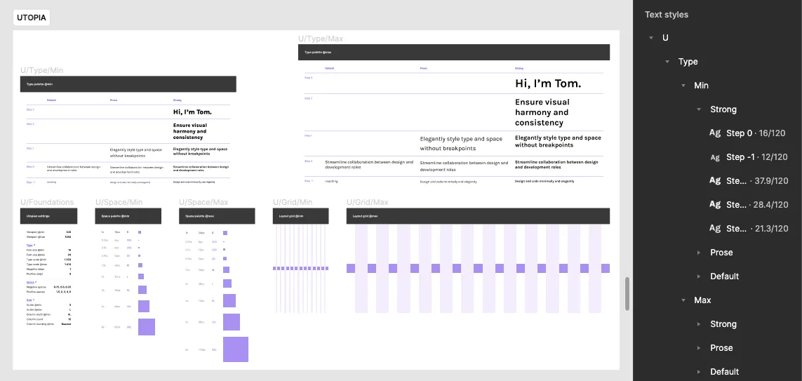
When You rerun the plugin, these styles get updated — and your designs will, too. You’ll see.
Decide if You want to use a baseline grid
A baseline grid can make You feel extra special ✨. Or help You with your design or whatever.
There are lots of ways to use a baseline grid. The Utopia Figma plugin generates one for You, so it’s not too hard to get started.
If You’re like thank you, nopedy-nope! — move on to the next step.
If, however, yass, puhleaseee! — I recommend You read Designing a Utopian layout grid. There’s diagrams there and a step-by-step guide and You’ll get a glimpse of the messiness that awaits You down this path.
Create a frame for min
Your first goal is to figure out the font size.
-
If You’re not using a grid, decide on a width and create a frame for your
minstate. To help You with this, see the section “1. Choose @min viewport width” in Designing a utopian layout grid. (Yes, that section of the article is relevant here.) -
If You are using a grid, the issue is how to fit the grid into the frame — do you stretch one or the other, or leave it kind of overlapping or what? There is a simple solution proposed in the grid guide mentioned earlier: make your
minframe the width of the generatedmingrid. Do it. It won’t be exactly your officialminwidth, but it should be close to it. Nobody will ever know. buahaha! Then try to calm down and apply the grid style to the frame. -
Design stuff until You get a sense for a workable
font size. Don’t worry, You can change this at any point.
Now You should have a piece of body text in your design sized in a way where You’re like “I can work with this”.
Don’t put too much pressure on yourself to ‘get it right’ at this point, whatever that means in this kind of design. You’ll be reinventing, redeciding and remaking as You go along.
Give the body text a Utopia style
-
Run the ‘Utopia / Fluid type + space calculator’ plugin again, this time plugging in your chosen
widthandfont size. Or, if You’ve worked outmaxin parallel, both yourwidthsandfont sizes. -
Apply the appropriate generated style to the body text in your design:
U/Type/Min/Prose/Step 0.
Now, whenever you rerun the plugin with a different font size, your body text will update automatically!
Create a type scale
This was messy for me. Here’s a rough series of steps that might help You figure this one out:
-
If You haven’t already, add a different type of text to your design — something other than the body text. Maybe a heading or some smaller text like an image caption. The point is to have texts of different sizes to see how a type scale will fit into your design. Add what’s appropriate.
-
Apply Utopia styles to all pieces of text. You may not know what styles to pick at this point. That’s ok. Take some educated guesses and read on.
-
Now you should have at least 2 Utopian text styles living in your frame. Run the generator plugin again, just with a different type scale. Your text should change.
-
Keep making changes and rerunning the plugin until You find a scale that fits your needs. Things I did: mess with the scale ratio, change the number of steps in the scale, play around with font weights, etc. etc.
-
If You want to change multiple styles at once (for example, use a different font family for all your headings), use the ‘Utopia / Batch update text styles’ plugin.
Aside:
The generator plugin also generates a type scale in a bolder font weight. I haven’t seen this phenomenon talked about in the Utopia ecosystem. I took it as an invitation to adjust some font weights to my needs®.
What helped me
I felt this part of the process was especially iterative (messy) because there are so many moving parts: a whole scale of things living next to other things.— Too much for my brain!
So I made it easy for myself. Here’s that story:
While designing my landing page, I got obsessed with my big chunky hero-heading — I’m brave enough to admit that. I wanted it to stay on a single line. So I made it as big as possible and paid attention to the font size.
And I started to build my type scale around this piece of text.
That gave me something to go on: I knew I wanted a scale with a font size pretty close to what I had given my hero-heading. And since this was to be the biggest heading on the page, I knew this size had to be several steps up the ladder, since I needed room for my smaller headings.
It was almost like an algorithm in my brain to filter out scales that were potentially compatible with me. I knew what I wanted in a scale and wasn’t just blindly dating one after the other.
Now, this still took a lot of messing around. How many heading-hierarchies do I need for this site? Do I maybe wanna skip a scale-step between adjacent headings so that my h1 sticks out even more from my h2s? I want to live boldly, so how bold do I want my headings to be?
Nobody can answer these questions for You.
I settled these questions for myself. I committed to a scale with 3 steps, we had some adventures, we were living life… Then I added a blog to my site — which means more headings… and now my scale can’t handle my content anymore…
We’ve grown apart. Or, as they say:
🌞
Introduce Utopian spacing
- Pick a method below — A, B or C — and make all the spaces in your design Utopian. Whichever method You choose, consider using auto-layout whenever You can: it can help keep things unified and is straightforward to implement with grid and flexbox.
A. Do it by hand ✍️
This is the no shortcuts approach. Just make sure every spacing value in your design corresponds to a step in your system: type in the right numbers, drag your stuff to the right position and pay attention.
You might be asking yourself “really?”.
Well, this is how me and my two brain cells did it. It wasn’t too bad. A lot of peeking at the Utopia board, but that’s a small price to pay to be fluid, man 🐬.
B. Use variables 🌈
You can set up a spacing palette with variables like this:
Aside:
Are modes potentially useful in this scenario? There must be a good lifehack somewhere in here.
The upside to this method is You can pick your spacing from a menu and don’t have to peek so much. The downside is I don’t see how to make these variables update when You regenerate your palette…
…But…
…Psst…
…there might be a way…
…follow me into this dark alley, friend…
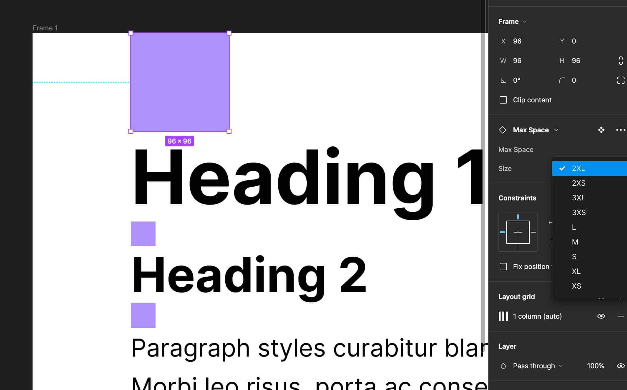
C. Use Utopia’s spacing components 🌚
Aside:
If You want to work on a custom spacing palette, You might do it this way. The spacing in your design will update each time you rerun the plugin with different parameters.
See these little squares that came out of the generator plugin? — the ones on the frame called “Space palette @min”? You can literally drag them into your design! Once they’re where You want them to be, just select the variant You want from the little drop-down menu and there’s your spacing: 2xs, m, 3xl — all your favorite t-shirt sizes! And when You’re sick of looking at them, just close your eyes, press shift + g 3 times and they’ll go away.
How does that work, You ask?— They’re just, like, pieces of the grid, man! 🤯 Clever, clever, these Utopia designers.
Just set the numbers in your auto-layouts to 0 and put squares everywhere: in your gaps, your paddings… — your margins, if You need them! Stuffed one under your sofa and forgot about it for like 7 years until it was time to move? No problem, it’ll stay there, patiently waiting until it’s time. Its time…
Did I mention the squares are cursed with a terrible curse? No?
But they come with a frozen yoghurt! I call it “froyo”!
Aside:
For this website, the default spacing palette with some added custom pairs worked alright. I felt it was a decent balance between constraint and freedom.
Now You should have a design that’s pretty Utopian. And if You ever need to do it all again, You are well prepared: You know how to wrestle with text; You know 3 ways of handling spacing; You are at peace with the grid.
Go out there, make some mistakes and enjoy that sweet consistency!
Implement
Aside:
There are plugins to help with this, but I won’t be using them here. See Utopia-Tailwind integrations for more info.
- Get those CSS custom properties out of your system and into your config. Go to the Utopia website, plug in the values You used with the Figma plugin (they live on the left-most generated frame) and copy the CSS output into your project.
Uhmmm, copy where?
You have options.
A. You can sort of ignore the variables and just copy their values (e.g. just the raw clamp() function) into your Tailwind config. Chris Penrod does it this way.
B. You can go an extra step and first put all the variables into a base.css file. Then reference them in your Tailwind config.
I did it extra 🧑🍳 like this so I can easily copy and paste Utopia’s output wholesale into base.css whenever I iterate (change my mind) — which, I know I will.
This is what option B looks like:
/* base.css
-- many values ommitted for brevity */

@tailwind base;
@tailwind components;
@tailwind utilities;

:root {
	/* type */
	--step--1: clamp(0.75rem, calc(0.65rem + 0.52vw), 1.06rem);
	--step-0: clamp(1rem, calc(0.83rem + 0.83vw), 1.5rem);

	/* spacing */
	--space-3xs: clamp(0.25rem, calc(0.21rem + 0.21vw), 0.38rem);
	--space-2xs: clamp(0.5rem, calc(0.42rem + 0.42vw), 0.75rem);

	/* spacing one-up pairs */
	--space-3xs-2xs: clamp(0.25rem, calc(0.08rem + 0.83vw), 0.75rem);
	--space-2xs-xs: clamp(0.5rem, calc(0.29rem + 1.04vw), 1.13rem);

	/* spacing custom pairs */
	--space-s-l: clamp(1rem, calc(0.33rem + 3.33vw), 3rem);
	--space-xl-m: clamp(2.25rem, calc(3.25rem + -1.25vw), 3rem);
}
/* tailwind.config.cjs
-- many values ommitted for brevity*/
/** @type {import('tailwindcss').Config} */
module.exports = {
theme: {
extend: {
fontSize: {
'fl-sm': 'var(--step--1)',
'fl-base': 'var(--step-0)'
},
spacing: {
'space-fl-3xs': 'var(--space-3xs)',
'space-fl-2xs': 'var(--space-2xs)'
}
}
}
}You can change these class names — fl-sm, space-fl-3xs — to your liking. I took this naming system from Chris. The “fl” stands for “fluid”.
Mmmmmm… fluid 🧃.
- With this setup type in
p-spasomewhere where You’d put a CSS class. You should see a list of all your fluid padding steps. This should also work for any other Tailwind spacing utility likegap,spacingandmargin. And for text sizes.
Now, if You’re starting a fresh project, You are ready to code it with entirely fluid spacing and typography! 🙌
If You’re redesigning an existing project
- Replace static classes with fluid ones.
Something to help with that:
[\s"']([mp]|gap|space)-?\w?-\d
This little formula finds many (but surely not all) of the standard Tailwind spacing classes. I mostly wrote it to feel like a wizard for 10 minutes. But also, without it, I would have had to search for each padding variation (pt, pb, p-, px-, py) individually (and then for each gap variation, etc.).
To use this regex, paste it into the ‘global search’ in your code editor (the one where you search through all your files at once — it’s cmd + shift + f in VSCode). For it to work, You might have to turn on regex somewhere in your search (in VSCode there’s a little button that says .* on the right of the searchbar).
Nothing left to do but to take a sip of your favorite beverage and go to town!
…Fluid town
🤿
Ways into Utopia
Utopia is a tool to help with responsive design. On their website, You plug in certain parameters and it generates CSS that makes your text and spacings adjust to the user’s viewport size.
Instead of media queries, it uses a ‘fluid’ approach to a problem we web designers face every day (every day I live in a society).
Where to start
I recommend these resources to get a hang of the general concept. (You don’t have to consume all of them — these are different approaches to the same information.)
- 🤏 An interactive demo, which Yndou can play with to get a sense of what Utopia does. (You can also simply resize this website.)
- 👁, 🦻 An intro video by the creators (18 minutes).
- 📜, 👁 An intro article where You can also look at a diagram illustrating the idea.
- 📜 A longer intro article that also explains the context of the larger problem.
- 🤏, 📜, 👁 The official Figma starter project where You can jump in and play. You’ll also find a succinct intro on the ‘readme’ page and multiple illustrations.
In a nutshell
Because tidbits can help me remember stuff, here are some quotes from the Utopia blog bringing out the essence of the approach:
- Define a type scale for a small screen
- Define a type scale for a large screen
- Tell the browser to interpolate between the two scales, based on the current viewport width
I designed these [min and max], maths designed this [everything in between]
source same as above
(…) we only need to visualise the smallest and largest states, which we call @min and @max. Everything in between will be displayed according to the rules we set.
(…) fluidly interpolating between two modular scales, one for smaller screens, and one for larger screens
Dictionary of the Utopia UI
These are the terms used in the UI of the Utopia website at the time of writing:
min
The smallest state/viewport You feel like visualising in your design. The font size will never go smaller as @min.
max
The largest state/viewport You feel like visualising in your design. The font size will never go bigger as @max.
width
The min and max states are defined in terms of their widths.
font size
The size of the majority of text in your project — the body text size. Serves as the base step for your type scale. Choosing the font size is often done early in the design process.
type scale
The ratio used to create a modular type scale, with font size being the base step. This can sound exotic, but it’s really just a way to let math help You come up with a palette of font sizes. (So You don’t have to ask yourself: “should my h1 be 48px or 49px?”)
Why this guide
I yearned for a practical guide like this when I was using Utopia for the first time.
It took time I got until I got a workflow together. There was poring over quite a few resources. There was experimentation. There was some wild flailing. I want to pass on something of that experience.
But I had a moment of doubt writing this guide: I worry that the creators intentionally didn’t give specific instructions on how to work with their system. I looked them up, they’re experienced designers. I can imagine that once you’ve seen the kinds of design processes they’ve seen, you realize that some things can’t be boiled down. Multiple stakeholders, rounds of iteration, the style of the project — it may be too messy to encapsulate into a method like that. Instead, Utopia seems more like a set of tools that you can use whenever you run into the particular problem of responsiveness, maybe even in UIs outside of browsers.
Let’s keep design messy 🫀.
And yet… here’s also a rough roadmap. Maybe not to show You the way, but just to show that there is a pretty easy one here. Come along, the views are great!
On that note — this section got so big, I’m making it into its own article about the problem of onboarding. I would love to talk to people and get some input. So if You ever got frustrated about documentation, or designed an onboarding process, or written documentation where You were worrying about making it welcoming to beginners, give me a shout!
Outro and thanks
Hope you enjoyed, learned something, or killed some time!
I appreciate any feedback! Let me know your Utopian workflows. Say hi if You vibe, don’t be shy! And especially — let me know if you got stuck, peeved, inspired or if you want more!
PS. I’m not affiliated with Utopia, I just used it.
Thank You, my wonderful editors: Thays Biodere and Yemima Fink. Your feedback was invaluable and made this text clearer, shorter and more to the point — a more pleasant experience for everybody :).
Thank You, Utopia creators — Trys Mudford and James Gilyead — for creating this tooling ecosystem that I think makes systematic design a little more accessible! Thank You for writing and producing so much documentation — I know how time consuming that can be. And thank You for making it all available for free.
Thank You, Christian Penrod! You helped me realize that actually using Utopia in my Tailwind project would go down without too much of a hassle.
Thank You, all the people that came before who figured out the math to the responsive design problem and cared enough to keep implementing this by hand (until a few of them finally got sick of it)!
Resources
The other guides
-
Tailwind CSS Responsive Design Without Breakpoints by Christian Penrod shows another way to implement the Utopia system in Tailwind. The way I do it in this guide builds on his approach. His writing is much less verbose than what You’re reading here. Much less verbose.
-
Designing a Utopian layout grid by James Gilyead from the Utopia team gives a step-by-step method. It only goes through part of the process, but that was already immensely helpful to me. Even more important, it acknowledges that the design process is messy and full of questions that only You can answer. Which is fun.
Utopia stuff
For a list of introductory resources about Utopia, see the above section Ways into Utopia.
Utopia-Tailwind integrations
I found two plugins that were made to help with integrating Utopia into Tailwind. Neither worked out of the box for me and I wasn’t in the mood for hacking.
- cwsdigital/tailwind-utopia
- domchristie/tailwind-utopia. This one’s a fork of the
cwsdigitalone but has a different API.
Fluid design more generally
-
See TailwindCSS: Fluid typography with CSS Clamp if You want to skip Utopia and do more of the heavy lifting yourself.
-
Linearly Scale font-size with CSS clamp() Based on the Viewport by Pedro Rodriguez goes deep into
clampand interpolation, if You’re into that.
Limitations
-
In Responsive Type and Zoom Adrian Roselli warns against using
clampbecause of issues with zooming. (Testing it on my site, zooming seems to work in Chrome and Firefox now.) -
In Fluid Type Elise Hein talks about some fundamental questions in a very approachable way. Why do we care about fluid type in the first place?